Have you ever worn a certain outfit and suddenly felt like you looked more tired, dull, or older—even though nothing else had changed? Psychology and visual perception research suggest that colours play a surprisingly powerful role in how youthful or aged we appear. The shades we wear, especially near our face, influence how others unconsciously interpret our energy, health, and vitality.
Experts explain that perceived age is often shaped not by wrinkles or skin texture alone, but by colour contrast, brightness, and undertone harmony between clothing and natural facial features.
Why Colours Affect How Old We Look
Human perception relies heavily on visual contrast. Younger faces naturally display stronger contrast between skin tone, lips, eyes, eyebrows, and hair. As people age, this contrast naturally softens.
When clothing colours either flatten this natural contrast or exaggerate shadows, the brain may interpret those visual signals as fatigue or ageing—even if the person’s skin and facial features have not changed.
Psychologists studying visual perception describe this as “perceived age cues,” where colour influences first impressions about vitality and alertness.
Colours That Commonly Make People Look Older
1. Muddy Neutrals and Dull Earth Tones
Colours such as:
- Yellow-beige
- Khaki or olive green
- Taupe or mushroom tones
- Brownish-grey
These shades often resemble undertones associated with fatigue or illness. When worn close to the face, they can reduce vibrancy and make skin appear sallow or dull.
Muddy colours remove natural contrast between facial features and clothing. This makes the face appear flatter, which the brain often associates with ageing.
2. Washed-Out or Icy Pastels
Pastels can be flattering, but certain pale or bluish versions often create ageing effects, especially:
- Baby pink
- Icy lavender
- Cool mint green
- Chalky pastel blue
These shades may make lips appear pale and highlight dark circles or skin unevenness, particularly on warmer or deeper skin tones.
3. Flat or Harsh Black Near the Face
Black is often considered timeless and elegant, but psychology and styling experts note that solid black worn close to the face can:
- Emphasize wrinkles and lines
- Deepen eye shadows
- Create harsh contrast with softer mature features
While black suits individuals with naturally high facial contrast, it can appear draining for many people as skin tone and hair contrast soften with age.
The Psychology Behind Colour and Perceived Age
Visual psychology suggests the brain associates brightness and contrast with health and youthfulness. When clothing reflects natural tones found in healthy skin or lips, it creates an impression of freshness.
Conversely, colours that mimic tones linked to fatigue or low vitality often trigger subconscious ageing signals.
There are generally two ways colours can add years:
- Flattening natural contrast – making facial features blend together
- Creating harsh contrast – highlighting shadows and lines
Colours That Often Make People Look Younger or Fresher
While individual colouring varies, experts frequently observe that these shades enhance vitality for many people:
- Soft navy
- Deep teal
- Warm raspberry or berry tones
- Rich cocoa or chocolate brown
- Clear mid-tone blues or greens
These colours usually enhance natural eye brightness and skin tone warmth without creating harsh shadows.
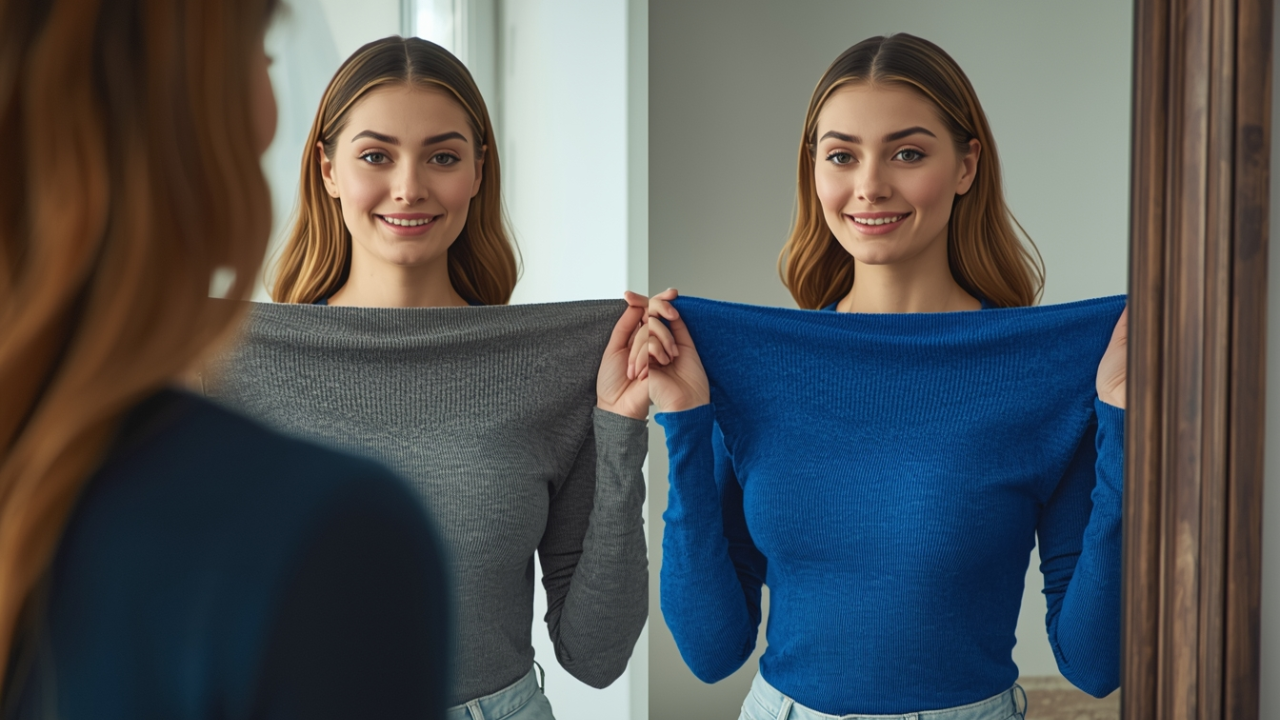
A Simple Home Test to Find Your Best Colours
You can easily test how colours affect your appearance using natural daylight.
Step-by-Step Method:
- Stand near a window with natural light.
- Pull hair away from your face.
- Remove heavy makeup if possible.
- Hold different coloured garments under your chin.
- Observe your face, not the clothing.
Look for changes such as:
- Brighter eyes
- Reduced under-eye shadows
- Clearer skin tone
- Natural lip colour enhancement
If a colour makes your skin appear dull or highlights imperfections, it may be ageing your appearance.
How to Wear Difficult Colours Without Looking Older
You don’t have to remove these shades completely from your wardrobe. Psychology-based styling suggests adjusting placement instead.
Smart Styling Tips:
- Wear ageing colours as trousers, skirts, or accessories instead of tops.
- Add scarves, jewellery, or layers in brighter tones near the face.
- Choose textured fabrics instead of flat solid colours to soften contrast.
This allows you to keep favourite clothing while improving overall visual freshness.
How Skin Tone and Hair Colour Changes Influence Colour Choices
As people age, natural pigmentation changes slightly. Hair may lighten or grey, and skin tone may soften or lose contrast. Colours that worked earlier in life may not produce the same flattering effect later.
Rather than following strict fashion rules, experts recommend adjusting colours gradually based on current skin and hair tone.
The Emotional and Psychological Impact of Colour Choices
Clothing colours not only influence how others perceive us but also affect self-confidence. Wearing shades that enhance facial brightness often improves mood and body language.
Studies in colour psychology suggest people feel more energetic and socially confident when wearing colours that visually support their natural features.
Key Insights
| Colour Category | Effect on Appearance | Recommendation |
|---|---|---|
| Muddy neutrals | Create dull, fatigued look | Avoid near face |
| Icy or washed-out pastels | Highlight shadows and uneven skin | Choose warmer or richer versions |
| Harsh black | Emphasizes lines and hollows | Use with softer textures or layering |
| Vibrant mid-tones | Enhance contrast and vitality | Ideal for tops and accessories |
Frequently Asked Questions
Do older adults need to avoid black completely?
No. Black can still be flattering, especially for individuals with strong natural contrast. Adding softer fabrics or combining black with lighter accents can reduce harsh effects.
Are all pastels ageing?
Not always. Creamy or warm-toned pastels often look fresher than cool, icy pastels.
Can makeup balance ageing clothing colours?
Sometimes, but clothing colours strongly influence facial brightness. The wrong shade may require excessive makeup to compensate.
Do men also experience colour-related ageing effects?
Yes. Colour perception psychology applies to all genders. Shirt colour significantly influences perceived vitality and professionalism.
What colour is most universally flattering?
Mid-tone blues and teals are often widely flattering because they brighten eye whites and complement multiple skin tones.
Conclusion
Colour plays a powerful psychological role in shaping perceived age and vitality. Muddy neutrals, washed-out pastels, and harsh black tones often add visual years by flattening or exaggerating facial contrast. Meanwhile, richer mid-tone colours tend to enhance brightness and natural feature definition.
Understanding how colours interact with individual skin tone and facial contrast allows people to make wardrobe choices that highlight freshness and confidence rather than unintentionally creating fatigue or ageing effects.
Ultimately, the goal is not to chase youth but to choose colours that reflect vitality, personality, and authenticity.